Some of you might know that I’m one of main developers who worked on the bhg.com site relaunch of 2015. I enjoyed applying many responsive techniques to the website. I used freely the relative new FLEXBOX feature in CSS.
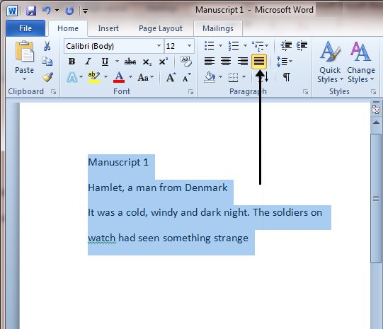
One of the more challenging aspects of the site design is the homepage. The designer’s dream was to create a responsive center cropped images horizontal alignment in a justified fashion. When I say “justified” I mean the typography alignment justified as if you would do below:

To apply such an effect to web design is not as an easy task. Although flexbox does have the justify-content: space-between it actually does not work with this particular requirement. Because in addition to the justified look, the designers also wish to have the images naturally increase in size while the viewport increases in width to achieve a fully responsive look. To add to the challenge, the images inside the boxes are not all square images. The square look must be achieved by CSS without distorting the images.
The ultimate effect:
This effect requires the image to increase its dimensions while maintain its ratio with the parent container.
I achieved this effect by using percentages with flexbox. I applied percentage negative margins to stretch the inner boxes for the justified look. The width of the image inside of the box is 80% of the its containing box. This allows the images to resize based on the viewport width.